 CYNDRA
You open the Monday operations dashboard expecting routine green tiles. Instead, the support queue is filling with complaints tied to a payment processor, control tests are aging, and a key incident metric has moved without triggering an alert. The executive standup starts soon, but nobody can tell you whether the problem is isolated, worsening, or already affecting customers.
That's the operating failure an operational risk dashboard should prevent. It isn't a board slide with attractive colours, a financial risk report, or a compliance tracker. It's a daily instrument for seeing where the business is breaking, where controls are weakening, and who needs to act before a disruption reaches customers, executives, or regulators.
Table of Contents
- The Monday Morning That Made Us Rebuild Our Dashboard
- Core Metrics and KRIs Every Dashboard Should Carry
- Mapping Your Data Sources Without Drowning in Them
- Designing the Architecture for Daily and Real-Time Use
- Access Controls and Alert Routing by Audience
- Rolling Out in Phases Without Alert Fatigue
- Bringing It All Together for Operators
The Monday Morning That Made Us Rebuild Our Dashboard
At 7:30 on Monday, our dashboard showed a small cluster of support tickets linked to a key payment processor. The volume looked ordinary. The pattern was not. Tickets were concentrated in one workflow, arrived close together, and pointed to a service issue before it became a customer-wide outage.
I brought in the on-call operations lead before the executive standup. The team checked the processor's status, compared tickets with transaction errors, and shifted traffic to the fallback path. The disruption stayed contained, and most customers never noticed it.
That incident changed how we judged the dashboard. The previous version looked polished in board meetings, with clean red-amber-green tiles and concise summaries. It gave executives a quick narrative, but it gave operators little they could act on during the week.
A board pack is not an operating instrument
The old dashboard failed in three specific ways:
- Stale thresholds: Limits were set once and ignored as transaction volumes, vendors, and workflows changed.
- Presentation metrics: The view favoured measures that were easy to explain in a meeting instead of signals that exposed deterioration early.
- No operating context: A rising count came without financial impact, customer impact, affected process, or the owner responsible for the next decision.
A daily operating dashboard must show incidents, near misses, control health, KRI movement, process disruption, and emerging threats. A financial risk report answers questions about capital, exposure, and financial position. A compliance dashboard covers attestations, audit activity, policy adherence, and remediation. Those views serve different decisions and should not be merged into one executive scorecard.
The audience determines the useful detail. First-line operators need the underlying record and a clear action. Control owners need to see what failed and what remains overdue. Second-line risk needs threshold history, trend context, and room to challenge the result. The COO needs a dependable view of what changed overnight and where intervention is required.
Operator's rule: If a metric cannot change a decision someone can make this week, remove it from the daily dashboard.
Avoid alert fatigue by routing exceptions to an accountable person, not to every dashboard viewer. Review thresholds when volumes, vendors, or workflows change. A red tile without a current owner becomes decoration. A rising count without business value is also weak evidence. Pair event volume with customer effect, service interruption, financial exposure, or control impact so the team can rank work rather than chase noise.
The Basel Committee's operational risk dashboard reporting provides historical context for how capital requirements and operational losses change as standards evolve, including 2012 as a practical historical baseline for comparing loss trends and capital requirements across major banking markets. Use that context for risk reporting. Do not present it as the live control surface operators use each morning.
Teams building a wider risk programme can also consult gestione rischio PMI 2026 for practical operational risk planning in smaller and mid-sized businesses. Our rebuild passed one test: the COO, operations lead, and on-call responder could see the same problem, understand its significance, and identify the next owner without opening five other systems.
Core Metrics and KRIs Every Dashboard Should Carry
Start with a compact metric set. The dashboard should show enough coverage to detect different forms of operational deterioration, but not so much that every user needs a training session to interpret it.
The core operating view
Carry these metrics as a baseline:
- Incident count and severity: Show volume alongside severity, business service, root cause, and status.
- Detection and resolution time: Track how quickly the organisation notices and closes incidents.
- Control failure rate: Separate failed controls from controls not tested, because those indicate different problems.
- KRI breaches: Show current state, recent movement, threshold, and accountable owner.
- Overdue RCSA items: Make age and risk rating visible, not just the number of overdue assessments.
- Vendor concentration: Identify where critical processes depend on the same provider or service path.
- Process downtime: Tie downtime to the affected workflow and customer-facing service.
- Workflow error rates: Break errors down by process, system, location, and control point.
- Near-miss volume: Treat near misses as early evidence about controls, while interpreting reporting increases in context.
An effective dashboard should combine at least five data streams and show both event count and event value. A count spike with stable value can indicate broad control degradation, while a stable count with a value spike can indicate a tail event. The operational risk dashboard guidance from RiskHub makes this distinction central to practical dashboard design.
| Metric | Signal type | Primary owner |
|---|---|---|
| Incident count and severity | Lagging and coincident | First-line operations |
| Detection and resolution time | Coincident | Incident management |
| Control failure rate | Leading | Control owner |
| KRI breach count | Leading | Business risk owner |
| Overdue RCSA items | Leading | Process owner and second line |
| Vendor concentration | Leading | Third-party risk |
| Process downtime | Coincident | Service owner |
| Workflow error rate | Leading or coincident | Operations manager |
| Near-miss volume | Leading | First-line teams |
Pair every count with a value signal
Counting incidents is easy. Prioritising them is harder. A high incident count might reflect a healthy reporting culture, a noisy system, or a deteriorating control. One severe event might matter more than dozens of low-impact events.
For every count, add a value dimension such as financial impact, customer-impact hours, affected transactions, critical services affected, or regulatory significance. If your current reporting system can't provide a value field, mark the gap openly rather than pretending the count is sufficient. A useful KPI dashboard framework can help teams distinguish the metric itself from the decision the metric supports.
Mapping Your Data Sources Without Drowning in Them
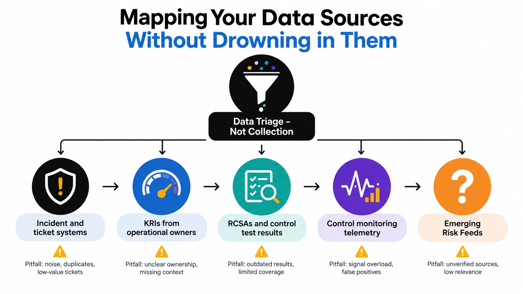
Data sourcing is triage, not collection. Wiring every available feed into a dashboard creates a technical achievement and an operational mess.
Five source categories matter:
- Incident and ticket systems show what already broke, including timestamps, affected services, severity, and remediation status.
- KRIs from operational owners show where exposure is tightening before an incident occurs.
- RCSAs and control test results show where controls are weak, overdue, or untested.
- Control monitoring telemetry provides continuous evidence from systems, workflows, access reviews, reconciliations, or service performance.
- Emerging risk feeds add context from regulatory bulletins, threat intelligence, supplier notices, and relevant external events.
Each category answers a different question. Incident data tells you what happened. KRI data tells you what may happen next. RCSA data tells you what the business believes about its controls. Telemetry tests whether those controls are operating. External feeds explain risks your internal systems can't see yet.
Layer sources deliberately
Start with the two categories that already live in clean, governed systems. Validate ownership, field definitions, timestamps, and failure handling before adding another feed. A source that stops refreshing without warning is more dangerous than a source you haven't connected.
Use cadence as a hard filter. Risk-management practice commonly uses daily or real-time refreshes for active monitoring, with monthly analysis for loss trends. Typical dashboard measures include loss events, KRI status, RCSA results, control effectiveness, open issues, overdue tests, compliance adherence, and incident response time, as described in risk dashboard operating guidance.
A quarterly feed doesn't belong in a daily alert queue. Put it in the monthly pack and label it accordingly. If a source can't answer a question an operator can act on this week, it's decoration.
Designing the Architecture for Daily and Real-Time Use
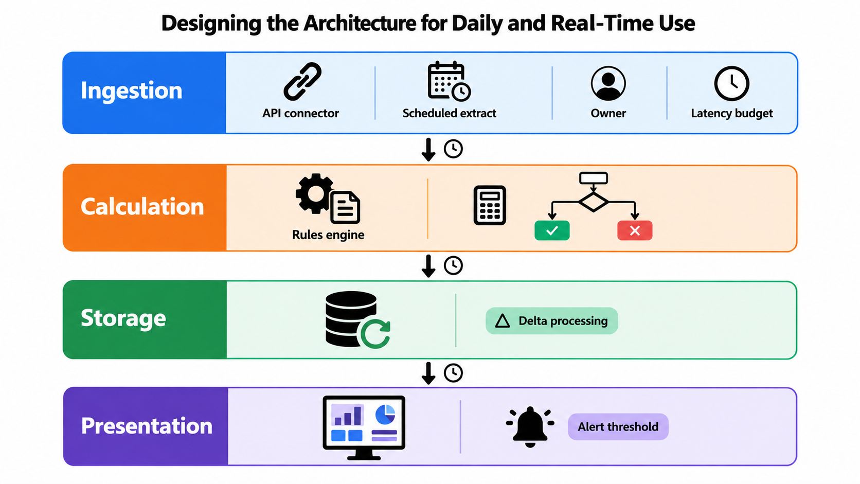
The architecture should support decisions, not just data movement. Build four layers and assign an owner to each one.
Ingestion
Use API connectors or scheduled extracts, depending on what the source supports. Every source needs a named owner, a documented refresh expectation, and a failure state that appears visibly in the dashboard. “Last updated” should be a first-class field, not hidden in a technical log.
Calculation
A rules engine should standardise definitions, calculate ratios, apply thresholds, and preserve the underlying values. Keep business logic outside individual visualisations so a threshold change updates every relevant view.
The default trend window should display 13 months of data, a practical heuristic that keeps year-over-year context visible while preserving monthly movement. The MetricStream risk management dashboard guidance also stresses the danger of overloading dashboards and using poorly calibrated thresholds, both of which create false alarms.
Storage and presentation
Store historical values, threshold versions, data-quality states, and alert outcomes. Without history, you can't tell whether a metric moved because risk changed or because the definition changed.
Design the main view for a laptop at the start of the day, not a wall display in a boardroom. Operators need dense, sortable information, drill-down to the source record, and filters by service, owner, severity, and status. The canonical view should answer:
- What changed since the last refresh?
- Which risk is climbing?
- What needs a decision today?
Alerts and threshold calibration
Use relative thresholds alongside business appetite thresholds. A static limit can remain technically valid while becoming operationally useless as volumes and workflows change. Review every threshold with its date, rationale, owner, and expected action.
Critical KRIs may need near-real-time freshness. Lower-priority indicators can tolerate overnight latency. Don't promise real-time data where the source can only provide a daily extract.
Thresholds are controls. Treat their ownership and change history with the same discipline as any other control.
For automation, tools such as dashboard automation workflows can help orchestrate scheduled data pulls and exception reporting, but automation won't repair a weak metric definition or an ownerless alert.
Access Controls and Alert Routing by Audience
Most organisations reverse the access model. Operators receive a quarterly summary while executives receive every live alert. That's backwards.
Access should follow the action each audience can take. First-line operators need detailed records for the services they own. Second-line risk needs cross-domain visibility and the ability to inspect threshold changes. Executives need exceptions and decisions, not a firehose of green statuses. Auditors need evidence that cannot be edited without a trace.
| Audience | Access tier | Alert types | Escalation window |
|---|---|---|---|
| First-line operator | Detailed, service-level access | Critical breaches, failed controls, active incidents | Immediate acknowledgement |
| Domain lead | Domain-wide access | Warnings, repeated breaches, overdue remediation | Within 24 hours |
| Second-line risk | Cross-domain read access and governance logs | Material breaches, threshold changes, unresolved overrides | Defined by risk policy |
| Executive | Curated digest and exception view | Material exposure, critical service disruption, unresolved escalation | Executive review cycle |
| Auditor | Read-only historical access | Evidence requests and audit-relevant exceptions | Agreed audit timetable |
A critical breach should route to the named owner on call, not a shared inbox. A warning should reach the domain lead with a clear acknowledgement requirement. A watch state belongs in the daily review queue. Every route needs a fallback if the primary owner doesn't respond.
Preserve the evidence trail
Second-line risk and audit users should see the threshold-change log, override trail, source timestamp, and alert history. That supports accountability and makes it possible to reconstruct what people knew and when they knew it.
Practical secure analytics best practices provide a useful baseline for separating operational access from governance access. Apply the same discipline to the dashboard itself. Role assignments should be reviewed quarterly because process ownership changes faster than many access lists.
For auditability, retain immutable records of metric values, alert decisions, user actions, and ownership changes. The audit trail requirements guide is relevant when defining the evidence model, especially if dashboard outputs feed formal risk or compliance processes.
Rolling Out in Phases Without Alert Fatigue
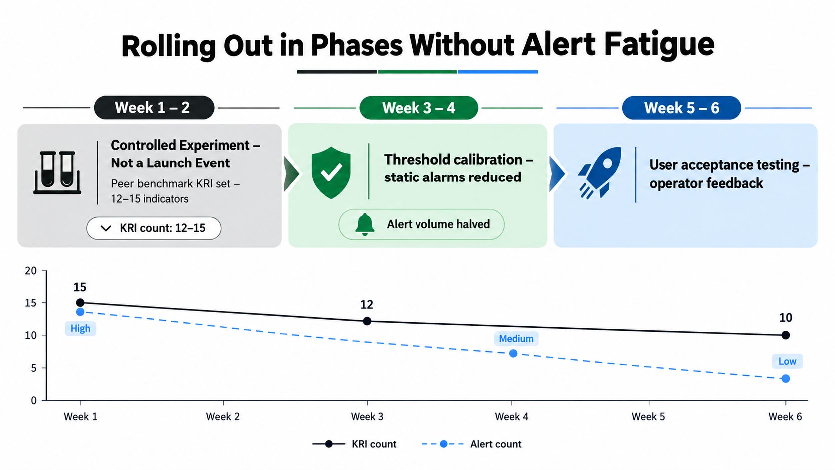
Don't launch the dashboard as a grand enterprise event. Run the first six weeks as a controlled experiment.
Begin with a generic indicator set covering incidents, control failures, vendor exposure, and a small group of process measures. The verified practical guidance recommends starting with 12 to 15 indicators, then refining the set once teams have observed how the signals behave. That's enough to test the pipeline without inviting every business unit to turn the dashboard into a personal reporting catalogue.
Use the rollout to learn what deserves an alert
During the first two weeks, keep thresholds deliberately wide. Collect baseline noise without paging operators for every movement. Check whether values arrive on time, whether owners recognise the metric, and whether a breach would produce a real action.
Then ask three uncomfortable questions:
- Did anyone act? Retire metrics that generate discussion but no decision.
- Was the threshold credible? Recalibrate using observed operating bands and business appetite.
- Was the owner clear? If a breach moves between teams, the metric isn't ready for escalation.
Resist the custom-view negotiation
The biggest rollout mistake is letting each business unit negotiate its own dashboard before the shared pipeline works. That produces dozens of panels with unclear ownership and competing definitions of “red.”
Stagger the audience instead:
- Operators first: Validate source records, actions, and escalation routes.
- Managers next: Add aggregation and exception review.
- Executives last: Provide a concise digest built from the same underlying metrics.
Each layer should add decision rules, not invent new indicators. Alert fatigue usually comes from weak thresholds, duplicate signals, and unclear consequence paths. The fix is not to mute everything. It's to make every alert specific enough that its recipient knows what to do.
Bringing It All Together for Operators
A dashboard earns its place on an ordinary Tuesday, when operators need decisions rather than presentation polish. The COO, ops lead, and on-call engineer should quickly answer: what changed, where is risk climbing, and what action is required?
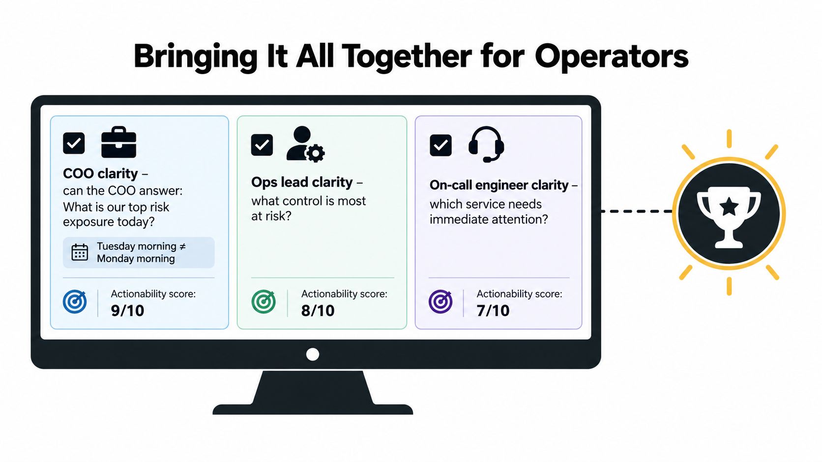
Keep these failure modes visible:
- Count without value: Event totals show activity, not which issue matters or what it costs.
- Static thresholds: A green status is misleading when limits no longer match operating conditions.
- Too many canonical views: Teams debate which dashboard is correct instead of acting on the signal.
Choose one clearly marked canonical view. Pair each event count with a value field, review thresholds on a regular cadence, and assign an escalation owner to every KRI. Put the top operational risks into a standing operating review, not an occasional reporting exercise.
Historical capital and loss data can provide context. The daily dashboard has a different job: show operational movement, connect signals to owners, and prompt action. Keep those purposes separate so the dashboard supports daily work instead of becoming another reporting obligation.
Cyndra can connect ticketing systems, project tools, spreadsheets, and other business systems, then produce scheduled reports and flag exceptions. If you are rebuilding an operational risk dashboard around ownership and traceable decisions, visit Cyndra to discuss the workflow with its team.